
Make Your Data Graphical in WPF
Data Visualization and User Experience (UX) is very important in making your apps easy to use. If your apps are easy to use, they will be cheaper for your employer, because users will require less training and grasp the data faster. Hopefully, that will reflect positively on you too!. In this blog post, I will show a simple way to display a bar graph inside your grid to represent data.
The Basic Ingredients
To make this work, we will use:
- Data Converter which allows the UI to convert a percentage value to a bar-graph width
- DataTemplateColumn in the grid to display the bar graph
- Rectangle, with variable width and colored background, to represent the value. Bind your rectangle width to the value
- Textblock with transparent background to display the numeric value
The Converter
If you work with WPF, you already know that converters are used to bridge the gap between your data and the UI. Your converter will implement the interface IValueConverter; that will allow you to add it as a resource to your page. Basically, you write a bit of code in a simple class, add it as a resource to your page, then reference it in your data binding. Here is the code to write the Converter:
using System;
using System.Windows;
using System.Windows.Data;

namespace CountJobTags {
    public class Pct2WidthConverter : IValueConverter {
        public object Convert(object value,
                             Type targetType,
                             object parameter,
                             System.Globalization.CultureInfo culture) {
            //'value' is PctAllowingRemote'
            if (value is double) {
            //Result will be int between 0 and 100: the width of the rectangle
                return (int)(100 * (double)value);
            }
            return 0;
        }

        //ConvertBack is used for read-write, this is readonly
        public object ConvertBack(object value,
                                  Type targetType,
                                  object parameter,
                                  System.Globalization.CultureInfo culture) {
            return DependencyProperty.UnsetValue;
        }
    }
}
Your UI calls your converter for the PctAllowingRemote value in every grid row. The parameter ‘value’ holds what we bind to in the grid. Don’t worry, this will make more sense shortly.
Reference the Converter in your XAML
Once we have the code class to convert between our value (PctAllowingRemote) and the rectangle width, we need to reference the converter class in our XAML. To do so, we will need:
- Resource
- XMLNS reference to the class namesapce in our XAML, basically a shortcut prefix
Here’s the XAML from the top of my window where I set-up the XMLNS reference (XMLNS == XML NameSpace):
<Window x:Class="CountJobTags.MainWindow"
        xmlns="http://schemas.microsoft.com/winfx/2006/xaml/presentation"
        xmlns:x="http://schemas.microsoft.com/winfx/2006/xaml"
        xmlns:local="clr-namespace:CountJobTags"
        Title="Analyze Job Tags" Height="750" Width="705"
        MinHeight="300" MinWidth="400"
        FocusManager.FocusedElement="{Binding ElementName=btnFetch}"
        DataContext="{Binding RelativeSource={RelativeSource Self}}"
        WindowStartupLocation="CenterScreen" >
Basically, the highlighted code allows me to reference my own code inside the markup, using the prefix ‘local’ in front of any class names I need. ‘CountJobTags’ is the namespace that my class lives in. Relax: the Intellisense will help you write this code if you just type ‘xmlns:’ and pause.
Now, let’s use the prefix ‘Local’ to reference my converter as a resource. We enter the XAML below somewhere on our page. Of course, there are other ways, this is the most straighforward. We’re almost there!
<Window.Resources>
    <!-- Converts percentage to an int between 0 and 100, suitable for binding to a rectangle width to represent a bar graph -->
    <local:Pct2WidthConverter x:Key="widthConverter" />
</Window.Resources>
Define a DataGridTempateDataColumn To Host The Bar
At this point, we have a converter and a means to reference it in our page. Now we need a special column in our grid that will host a Rectangle representing the value as its width. Here’s the simplified DataGrid with our template column, plus another column for comparison:
<DataGrid AutoGenerateColumns="False" Name="grdCountsByTag" IsReadOnly="True" >
<DataGrid.Columns>
<!-- Normal column for comparison -->
<DataGridTextColumn Header="Avg. Age In Hours"
Binding="{Binding AvgAgeInHours, StringFormat=N2}" />
<!-- Template holds rectangle, with variable width,
and a Textblock for the text -->
<DataGridTemplateColumn Header="%Allowing Remote"
CanUserSort="True" SortMemberPath="PctAllowingRemote">
<DataGridTemplateColumn.CellTemplate>
<DataTemplate>
<Border Width="104" Height="20" >
<!-- Grid allows us to put 2 controls -->
<Grid>
<!--Rectangle has its width bound to the
value we display, using the converter! -->
<Rectangle Height="18" HorizontalAlignment="Left"
VerticalAlignment="Center" Fill="DarkBlue"
Margin="2 0 2 0"
Width="{Binding PctAllowingRemote,
Converter={StaticResource widthConverter}}" />
<!-- Display the text; note transparent background color for Textblock
Color is chosen to be visible with either light or dark background -->
<TextBlock Background="Transparent"
Foreground="BurlyWood" HorizontalAlignment="Center"
Text="{Binding PctAllowingRemote, StringFormat=P}" />
</Grid>
</Border>
</DataTemplate>
</DataGridTemplateColumn.CellTemplate>
</DataGridTemplateColumn>
<DataGridTextColumn Header="Avg. # Related Skills"
Binding="{Binding AvgNumRelatedSkills, StringFormat=N2}" />
</DataGrid.Columns>
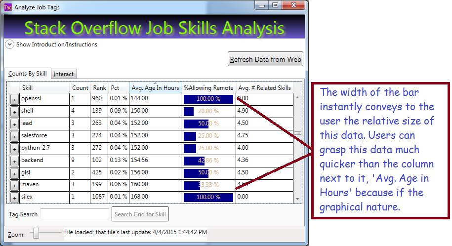
</DataGrid>The XAML above represents the simplified data grid with a normal column for comparison, and a template column which holds the bar. The template holds two controls, a Rectangle with variable width and a Textblock to display the text value. Important: note that both controls are bound to the same value, ‘PctAllowingRemote. The rectangle binds its width to the that value, using the converter we defined above, while the Textblock binds its text.
A couple key points:
- You can place any kind of control in a template column
- Normally you can only have a single direct child control; I used a layout grid (not a DataGrid) as the direct child and the grid will allow multiple child controls
- By giving the Textblock a transparent background, it will appear on top of the rectangle
- The text color is not super nice, but I have little choice because it must be visible with either a light or dark background
- Normal columns allow sorting by default; but note that I had to specifically allow sorting (CanUserSort=”true”) and specify the column to use (please refer to the XAML for details.)
Bind Your DataGrid to an IEnumerable
I bound my entire grid to a List<TagAndCount> in code. Hopefully you already grasp that TagAndCount is a class and each row in the grid represents an instance of that class. Obviously, the class has properties that correspond to the grid columns, such as ‘PctAllowingRemote’. Here’s the code to bind it:
List<TagAndCount> tagList);
//...Write code to build the list, then bind:
grdCountsByTag.ItemsSource = tagList;
Summary
WPF gives you a lot of flexibility on how to display data. You should make your data easy to understand using graphical techniques; that reduces training costs and improves comprehension of your data. Your users will thank you for making the data easier to use!
We displayed our data using a rectangle whose width is bound to the data we are displaying. The rectangle was bound using a reference to a converter class we wrote, which converted a percentage value into a different value between 0 and 100. The rectangle was displayed in DataGridTemplateColumn.
Get the Code
I already hosted this project on Codeplex. Occasionally I update that site and add features, such as my new bar-chart column. You can download the entire project or seem more of the code on line. The project is available here: http://visualizejobskills.codeplex.com/
 Randy's Rants, Ravings and Reflections
April 7, 2015 at 9:24 am
Reblogged this on Dinesh Ram Kali..