
UX
Use a DataBound Smiley Face for Super-Easy Data Comprehension
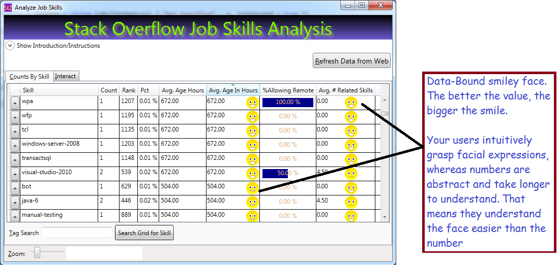
Humans can understand a smile in a heartbeat, but they need to think to parse a number. You can deal with that by displaying your data with smiley faces. Result: you will put a smile on your users’ faces, making their data easy to understand. By doing so, you’ll reduce your app’s overall costs, because training costs will be lower. Also, your users will get their work done faster when they can understand their data rapidly. For some apps, that speed can make the difference between profit or loss, such as apps used in fast-paced financial markets. If your company is work a meritocracy, you will be rewarded when your reduce costs for your company!
What We Will Use to Build Our Data-Bound Smiley Face
- A WPF UserControl
- WPF Geometry Drawing, including
- EllipseGeometry (to draw the eyes and the face)
- Geometry Path Markup Strings – to draw the smile
- DependencyProperty – we add one to our UserControl to expose our new property ‘SmilePct’
- DataBinding – I’ll share a real pain-saver that will help you bind UserControls in DataGrids
- DataGridTemplateColumn – to host our SmileyFace in our grid
Get Started: Build Your UserControl
Hopefully you already know how to add a UserControl to your project (right-click your project in Solution Explorer, choose, ‘Add’, then pick ‘UserControl’). We will build a user control that has an Image for its XAML (no grid or StackPanel needed). We will draw 3 different parts in our image:
- The Face
- The Smile (data-bound)
- The Eyes
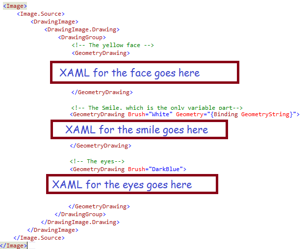
XAML for the Face
For the face, we will use a simple circle (actually an ellipse, but you probably know that a circle is merely a special case of an ellipse) with a gradient background.
<!-- The yellow face -->
<GeometryDrawing>
    <GeometryDrawing.Geometry>
        <!-- Draw the circle, which will represent the face -->
        <EllipseGeometry RadiusX="12.5" RadiusY="12.5" Center="6.25, 6.25"  />
    </GeometryDrawing.Geometry>
    <GeometryDrawing.Brush>
        <LinearGradientBrush EndPoint="0.5,1" StartPoint="0.5,0">
            <GradientStop Color="Gold" Offset="0"/>
            <GradientStop Color="Yellow" Offset="1"/>
        </LinearGradientBrush>
    </GeometryDrawing.Brush>
</GeometryDrawing>
To specify an ellipse, we describe the 1) size and shape using the RadiusX and RadiusY, plus 2) the position using the Center, which is described in Cartesian Coordinates (with the origin in the upper left corner of our Image). So, our face will be 25 pixels high (i.e. double the radius) and 25 pixels wide (double the RadiusX). Since RadiusX and RadiusY are equal, we will have a circle.
XAML for the Smiley
For the smile, we will use a string representation of the drawing to draw an ArcSegment. If you remember your geometry, or if you like to eat pies or pizza, you should already know that the ArcSegment is just the line represented by pizza crust. Basically a chunk of curve ripped out of a circle or, in the general case, an ellipse. We will build the geometry string in code; a sample geometry string looks like this: “M 0,10 A 10,25 0 0 0 12.5,10 Z”. I will explain how they work shortly; first, let’s look at the smiley XAML:
 <!-- The Smile, which is the only variable part-->
≶!-- The data binding will get the geometry from our code behind -->
 <GeometryDrawing Brush="White" Geometry="{Binding GeometryString}">
     <GeometryDrawing.Pen>
         <Pen Brush="RosyBrown" Thickness="1" />
     </GeometryDrawing.Pen>
 </GeometryDrawing>
It looks like not much is happening; that is because all the work is done via the Geometry property, which is bound to our code-behind. You can see the white brush, which is used for filling-in the teeth, and the pen (RosyBrown) which draws the lips. The shape of the lips is controlled via data binding, using a class property which I set in code. I will explain the Geometry string after explaining the XAML for the eyes. One further point: until now, I have not mentioned the data source I am binding to; in this case, I am binding to my own code-behind. I omitted that code until now (for clarity). To use your own code-behind for data binding, simply use the markup shown here to declare your UserControl:
XAML for the Eyes
For the eyes, we will draw two ellipses. They are similar to the face; their RadiusY is slightly larger than their RadiusX, to make them taller than wide, and they user different colors than the face.
<!-- The eyes-->
<GeometryDrawing Brush="DarkBlue">
    <GeometryDrawing.Pen>
        <Pen Brush="White" Thickness="1.5" />
    </GeometryDrawing.Pen>
    <GeometryDrawing.Geometry>
        <GeometryGroup>
            <!-- Draw 2 ellipses, each slightly taller than wide, for the eyes -->
            <!-- Left eye-->
            <EllipseGeometry RadiusX="2" RadiusY="2.5" Center="2,5" />
            <!-- Right eye-->
            <EllipseGeometry RadiusX="2" RadiusY="2.5" Center="10.5, 5" />
        </GeometryGroup>
    </GeometryDrawing.Geometry>
</GeometryDrawing>
Now, for the UserControl Code-Behind
The code-behind has a simple structure: just two properties:
- The GeometryString property, which tells WPF how to draw the smile, and
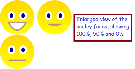
- The SmilePct property, which allows the outside world to control the size of our grin. 100% → big smile, while 0% → straight face
You might have noticed from my screen shots that my face never frowns, it just varies from a straight line to a big smile. I did that because, for one reason, it is a little easier, and also because I don’t want any frowns in my apps!
DependencyProperties
OK, I only have two properties, but you should make them be special DependencyProperty instances, because that is what works best with UserControls. DependencyProperties are similar to INotifyPropertyChanged properties, but designed for special situations like UserControls, etc. Here’s a quick tip: Visual Studio will help you stub-out a DependencyProperty if you type the shortcut ‘propdp‘ and hit the tab key. For details, take a look at my Visual Studio Quick Tip on the Snippet Manager. Here’s what my two properties look like:
private static string NO_SMILE = "M 5,12.5 A 10,0 0 0 0 7.5, 12.5 Z";

public string GeometryString {
    get { return (string)GetValue(GeometryStringProperty); }
    set { SetValue(GeometryStringProperty, value); }
}

//Windows stores the property value (for GeometrySttring) on your behalf, so you don't
//declare any variable to hold the value
public static readonly DependencyProperty GeometryStringProperty =
    DependencyProperty.Register("GeometryString", typeof(string),
	typeof(DataBoundSmiley), new PropertyMetadata(NO_SMILE));


public double SmilePct {
    get { return (double)GetValue(SmilePctProperty); }
    set { SetValue(SmilePctProperty, value); }
}

//Note the callback referenced below, 'OnSmileyPctChanged'
public static readonly DependencyProperty SmilePctProperty =
    DependencyProperty.Register("SmilePct", typeof(double),
	typeof(DataBoundSmiley), new PropertyMetadata(0.0, OnSmileyPctChanged));
Where’s the Logic?
I deliberately skipped the complicated part, so that I could emphasize the fact that I only have two properties in my code-behind. All the work happens when the SmilePct is set to a new value, which causes the callback method ‘OnSmileyPctChanged‘ to be invoked. That is where we assign the value for our GeometryString. The geometry string will vary between these two extremes, which I will explain shortly:
- Big Smile = “M 0,10 A 10,25 0 0 0 12.5,10 Z”;
- No Smile = “M 5,12.5 A 10,0 0 0 0 7.5, 12.5 Z”;
Geometry Path String Explanation:
- “M 0,10” means start the drawing at the coordinates (0,10). “M 5,12” means start the drawing at coordinates (5,12.5)
- “A 10,25 0 0 0 12.5,10 Z” defines an ArcSegment, where
- “A” means start the arc
- “10,25” means RadiusX =10,RadiusY =25
- “0 0 0” means: (first zero) rotate 0 degrees; (second zero) IsLargeArc = false; (third zero) means Clockwise = false
- “12.5,10″ means finish the arc at coordinates (12.5,10)
- “Z” means close the arc, i.e. draw a line from the end point to the start point, which, for us, represents the top lip
Besides ArcSegments, you can draw LineSegments, BezierSegments and QuadraticBezierSegments. You can read more about them here: https://msdn.microsoft.com/en-us/library/ms752293(v=vs.110).aspx. So, basically, my method ‘OnSmileyPctChanged’ serves to build a string like either 1) the big smile string listed above, 2) the no smile string, or 3) some arc segment intermediate between them. I’ll list the code here, but leave it to you to figure-out the algebraic computations involved. Remember, my callback is invoked when the SmilePct property is set.
public static void OnSmileyPctChanged(object sender, DependencyPropertyChangedEventArgs e) {
    double theVal = (double)e.NewValue;
    //protect against bad data:
    if (theVal < 0)
        theVal = 0.0;
    else if (theVal > 1.0)
        theVal = 1.0;

    double xInit = 5 - (5.0 * theVal);
    double yInit = 12.5 - (2.5 * theVal);
    double pctHappy = (25 * theVal);
    double xTerm = 7.5 + (5.0 * theVal);
    double yTerm = 12.5 - (2.5 * theVal);
    DataBoundSmiley theInstance = (DataBoundSmiley)sender;
    theInstance.GeometryString = string.Format("M {0}, {1} A 10,{2} 0 0 0 {3},{4} Z",
                                               xInit, yInit, pctHappy, xTerm, yTerm);
}
Final notes on the code-behind: the input parameter ‘sender‘ represents our UserControl; ‘e‘ is the event args, containing the NewValue (for SmilePct) and other info. Since the method is static (required by WPF), we need to set the value of the GeometryString on the specific instance of the control which is identified by the input parameter ‘sender’.
Code-Behind Summary
OK, at this point, I’ve shown you the code to create the UserControl, which is basically just a drawing with three ‘sub’ GeometryDrawing elements. We use ellipses for the face and eyes, and the smile is an ArcSegment which I bind to a DependencyProperty in my code-behind. The property ‘GeometryString’ is set in my method ‘OnSmileyPctChanged’; in that method, I use some algebra to define the ArcSegment corresponding to a big smile for high value of SmileyPct. All told, the control consists of
- 54 lines of XAML, and
- 60 lines of code
Using the Data-Bound Smiley in a DataGrid
I won’t talk about DataGrid basics here, suffice it to say that I will add a template column to my DataGrid to host my smiley UserControl. Actually, I want the single column to display a smiley face and a numeric value, which is easy if I embed a grid inside my template. Here’s the XAML, which I have simplified to only display the grid and the template column:
<DataGrid AutoGenerateColumns="False" Name="grdCountsByTag" IsReadOnly="True"  >
    <DataGrid.Columns>
        <!-- Other columns omitted for brevity. Define a template column here: -->
	<DataGridTemplateColumn Header="Avg. Age In Hours" CanUserSort="True" SortMemberPath="AvgAgeInHours">
            <DataGridTemplateColumn.CellTemplate>
                <DataTemplate>
                    <Grid>
                        <!-- Textblock holds the number -->
                        <TextBlock Text="{Binding AvgAgeInHours, StringFormat=N2}" />
                        <!--Now the smilley; note the data binding, which was tricky -->
                        <local:DataBoundSmiley Grid.Column="1"
                                               SmilePct="{Binding DataContext.AvgJobAgePct,
                                                          RelativeSource={RelativeSource AncestorType=DataGridRow}}" />
                        <Grid.ColumnDefinitions>
                            <ColumnDefinition />
                            <ColumnDefinition Width="auto" />
                        </Grid.ColumnDefinitions>
                    </Grid>
                </DataTemplate>
            </DataGridTemplateColumn.CellTemplate>
        </DataGridTemplateColumn>
    </DataGrid.Columns>
</DataGrid>
Notes:
The prefix ‘local’ is an XMLNS definition which we place at the top of our form, like this:
The namespace declaration allows us to reference classes from our own project in the XAML. The TextBlock is bound to a separate (but related) column: AvgAgeInHours. The Smiley control is bound to a field named ‘AvgJobAgePct’. The first, AvgAgeInHours, varies between 0 and 672 (usually), while AvgJobAgePct varies between 0 and 1; the two are inversely proportional. The data binding expression also bears notice, as I spent almost as much time on this as the rest of the code. It was a major source of frustration! Some key points:
- A normal control (such as my TextBlock) binds directly to the same data source as the grid
- Maddeningly, custom controls do not, their data source is, AFAIK, themselves
- Which is why I needed to use the RelativeSource syntax to find the data source for the Grid Row hosting our control, i.e.
RelativeSource={RelativeSource AncestorType=DataGridRow} - The DataContex syntax (e.g. ‘DataContext.AvgJobAgePct’) is used to avoid binding to properties of the Grid Row, such as width/height, and instead goes for the data source used to display the row
Summary
The smiley control quickly conveys meaning to your users, making their lives easier. A UserControl is the best way to build a re-usable container to display your data – without it, you would not be able to display smileys for two separate columns. The UserControl I built uses an Image containing a GeometryGroup which, in turn, holds three GeometryDrawings (face, eyes and smile). The Smile is defined in my control’s code-behind as a DependencyProperty; I build it using the syntax for the WPF Path Markup. Specifically, I use it to draw an ArcSegment, whose curve and endpoints vary according to the SmilePct. If you want your users to easily comprehend your data, I recommend you use my data-bound smiley, because users recognize faces with little mental effort. To get download code, you can go to my open source project on CodePlex: http://visualizejobskills.codeplex.com/
Make Your Data Graphical in WPF
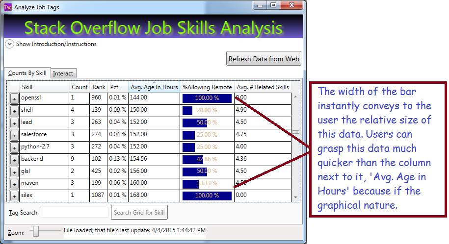
Data Visualization and User Experience (UX) is very important in making your apps easy to use. If your apps are easy to use, they will be cheaper for your employer, because users will require less training and grasp the data faster. Hopefully, that will reflect positively on you too!. In this blog post, I will show a simple way to display a bar graph inside your grid to represent data.
The Basic Ingredients
To make this work, we will use:
- Data Converter which allows the UI to convert a percentage value to a bar-graph width
- DataTemplateColumn in the grid to display the bar graph
- Rectangle, with variable width and colored background, to represent the value. Bind your rectangle width to the value
- Textblock with transparent background to display the numeric value
The Converter
If you work with WPF, you already know that converters are used to bridge the gap between your data and the UI. Your converter will implement the interface IValueConverter; that will allow you to add it as a resource to your page. Basically, you write a bit of code in a simple class, add it as a resource to your page, then reference it in your data binding. Here is the code to write the Converter:
using System;
using System.Windows;
using System.Windows.Data;

namespace CountJobTags {
    public class Pct2WidthConverter : IValueConverter {
        public object Convert(object value,
                             Type targetType,
                             object parameter,
                             System.Globalization.CultureInfo culture) {
            //'value' is PctAllowingRemote'
            if (value is double) {
            //Result will be int between 0 and 100: the width of the rectangle
                return (int)(100 * (double)value);
            }
            return 0;
        }

        //ConvertBack is used for read-write, this is readonly
        public object ConvertBack(object value,
                                  Type targetType,
                                  object parameter,
                                  System.Globalization.CultureInfo culture) {
            return DependencyProperty.UnsetValue;
        }
    }
}
Your UI calls your converter for the PctAllowingRemote value in every grid row. The parameter ‘value’ holds what we bind to in the grid. Don’t worry, this will make more sense shortly.
Reference the Converter in your XAML
Once we have the code class to convert between our value (PctAllowingRemote) and the rectangle width, we need to reference the converter class in our XAML. To do so, we will need:
- Resource
- XMLNS reference to the class namesapce in our XAML, basically a shortcut prefix
Here’s the XAML from the top of my window where I set-up the XMLNS reference (XMLNS == XML NameSpace):
<Window x:Class="CountJobTags.MainWindow"
        xmlns="http://schemas.microsoft.com/winfx/2006/xaml/presentation"
        xmlns:x="http://schemas.microsoft.com/winfx/2006/xaml"
        xmlns:local="clr-namespace:CountJobTags"
        Title="Analyze Job Tags" Height="750" Width="705"
        MinHeight="300" MinWidth="400"
        FocusManager.FocusedElement="{Binding ElementName=btnFetch}"
        DataContext="{Binding RelativeSource={RelativeSource Self}}"
        WindowStartupLocation="CenterScreen" >
Basically, the highlighted code allows me to reference my own code inside the markup, using the prefix ‘local’ in front of any class names I need. ‘CountJobTags’ is the namespace that my class lives in. Relax: the Intellisense will help you write this code if you just type ‘xmlns:’ and pause.
Now, let’s use the prefix ‘Local’ to reference my converter as a resource. We enter the XAML below somewhere on our page. Of course, there are other ways, this is the most straighforward. We’re almost there!
<Window.Resources>
    <!-- Converts percentage to an int between 0 and 100, suitable for binding to a rectangle width to represent a bar graph -->
    <local:Pct2WidthConverter x:Key="widthConverter" />
</Window.Resources>
Define a DataGridTempateDataColumn To Host The Bar
At this point, we have a converter and a means to reference it in our page. Now we need a special column in our grid that will host a Rectangle representing the value as its width. Here’s the simplified DataGrid with our template column, plus another column for comparison:
<DataGrid AutoGenerateColumns="False" Name="grdCountsByTag" IsReadOnly="True" >
    <DataGrid.Columns>

        <!-- Normal column for comparison -->
        <DataGridTextColumn Header="Avg. Age In Hours"
	    Binding="{Binding AvgAgeInHours, StringFormat=N2}" />

        <!-- Template holds rectangle, with variable width,
         and a Textblock for the text -->
        <DataGridTemplateColumn Header="%Allowing Remote"
			CanUserSort="True" SortMemberPath="PctAllowingRemote">
            <DataGridTemplateColumn.CellTemplate>
                <DataTemplate>
                    <Border Width="104" Height="20" >
                        <!-- Grid allows us to put 2 controls -->
                        <Grid>
                 <!--Rectangle has its width bound to the
                 value we display, using the converter! -->
                            <Rectangle Height="18" HorizontalAlignment="Left"
					VerticalAlignment="Center" Fill="DarkBlue"
					Margin="2 0 2 0"
                                Width="{Binding PctAllowingRemote,
					Converter={StaticResource widthConverter}}" />
                         <!-- Display the text; note transparent background color for Textblock
                         Color is chosen to be visible with either light or dark background -->
                            <TextBlock Background="Transparent"
					Foreground="BurlyWood" HorizontalAlignment="Center"
					Text="{Binding PctAllowingRemote, StringFormat=P}" />
                        </Grid>
                    </Border>
                </DataTemplate>
            </DataGridTemplateColumn.CellTemplate>
        </DataGridTemplateColumn>
        <DataGridTextColumn Header="Avg. # Related Skills"
		Binding="{Binding AvgNumRelatedSkills, StringFormat=N2}" />
    </DataGrid.Columns>
</DataGrid>
The XAML above represents the simplified data grid with a normal column for comparison, and a template column which holds the bar. The template holds two controls, a Rectangle with variable width and a Textblock to display the text value. Important: note that both controls are bound to the same value, ‘PctAllowingRemote. The rectangle binds its width to the that value, using the converter we defined above, while the Textblock binds its text.
A couple key points:
- You can place any kind of control in a template column
- Normally you can only have a single direct child control; I used a layout grid (not a DataGrid) as the direct child and the grid will allow multiple child controls
- By giving the Textblock a transparent background, it will appear on top of the rectangle
- The text color is not super nice, but I have little choice because it must be visible with either a light or dark background
- Normal columns allow sorting by default; but note that I had to specifically allow sorting (CanUserSort=”true”) and specify the column to use (please refer to the XAML for details.)
Bind Your DataGrid to an IEnumerable
I bound my entire grid to a List<TagAndCount> in code. Hopefully you already grasp that TagAndCount is a class and each row in the grid represents an instance of that class. Obviously, the class has properties that correspond to the grid columns, such as ‘PctAllowingRemote’. Here’s the code to bind it:
List<TagAndCount> tagList);
//...Write code to build the list, then bind:
grdCountsByTag.ItemsSource = tagList;
Summary
WPF gives you a lot of flexibility on how to display data. You should make your data easy to understand using graphical techniques; that reduces training costs and improves comprehension of your data. Your users will thank you for making the data easier to use!
We displayed our data using a rectangle whose width is bound to the data we are displaying. The rectangle was bound using a reference to a converter class we wrote, which converted a percentage value into a different value between 0 and 100. The rectangle was displayed in DataGridTemplateColumn.
Get the Code
I already hosted this project on Codeplex. Occasionally I update that site and add features, such as my new bar-chart column. You can download the entire project or seem more of the code on line. The project is available here: http://visualizejobskills.codeplex.com/
WPF – Animate Textboxes to Highlight Bad Data
WPF makes extremely good UIs (i.e. easy to use and attactive), but most programmers don’t take advantage of the power at their fingertips. One common scenario is providing immediate feedback when your users mess-up. I like to know immediately, not when I try to click the button to submit. Because I hate it when I don’t realize I made a mistake until long after the fact!

The Technique
- Set-up validation for multiple textboxes with the same code
- Using delegates to reduce your code!
- Build a border animation
- Using a gradient
- Your gradient will use a moving middle stop, generating something like a wiping effect
- Every time the textbox change event fires, call your validation on users’ text;
- If bad, display your fancy animation, and set the tool tip and status bar message
The result looks (IMHO) pretty slick and is hard. I prefer it to the standard technique (IDataErrorInfo) for scenarios when I have several textboxes with the same validation rules, because it is less work overall.
The Fun Part – Animate Your Border!
public static void ReddenTextboxBorder(TextBox txt, MainWindow theMainWindow) {
    //Starting by defining 3 gradient stops; the middle one will move from left to right
    GradientStop stop1 = new GradientStop(Colors.Black, 0);
    GradientStop stop2 = new GradientStop(Colors.Red, 0);

    //Since we created the stop 'on-the-fly', we need to register the name to animate
    theMainWindow.RegisterName("stop2", stop2);
    GradientStop stop3 = new GradientStop(Colors.Black, 1);

    //We will use the brush for the border being animated, tell it all 3 stops:
    LinearGradientBrush gradBrush = new LinearGradientBrush(new GradientStopCollection { stop1, stop2, stop3 });
    txt.BorderBrush = gradBrush;

    //The animation will go from 1% to 99% over .3 second time period:
    DoubleAnimation ani = new DoubleAnimation(.1, .99, new Duration(TimeSpan.FromMilliseconds(300)));
    //When we hit the right border, bounce back to the left again:
    ani.AutoReverse = true;

    //Storyboard helps connect the animation parts
    Storyboard sb = new Storyboard();
    Storyboard.SetTargetName(ani, "stop2");
    Storyboard.SetTargetProperty(ani, new PropertyPath(GradientStop.OffsetProperty));
    sb.Children.Add(ani);

    //After the animation is don, set the border to pure red (no gradient)
    sb.Completed += delegate(object sndr, EventArgs evtArg) { txt.BorderBrush = new SolidColorBrush(Colors.Red); };

    sb.Begin(theMainWindow);
    //By unregistering the name, I release memory and become confident I can re-run without issues
    theMainWindow.UnregisterName("stop2");
}
At this point, we have a method to animate any textbox, so long as it inhabits our main form. It looks cool and tells the user they messed-up with minimal pain. Now, let’s hook-up several textboxes to use our new method:
Connect the Animation to Your Validation
private void SetUpRequiredFieldValidation()
{
    //An array of textboxes which must be populated before user
    //can click the button to do some work
    TextBox[] _RequiredTextBoxes = new[] { txtName,
                         txtAddress,
                         txtCity,
                         txtState,
                         txtZip
                         };

    //Hook-up a TextChanged event for every textbox in the array;
    foreach (TextBox tb in _RequiredTextBoxes)
    {
        //Dynamically declare an event to fire for each textbox using a delegate
        tb.TextChanged += delegate(object sender, TextChangedEventArgs e) {
            //'ValidIdentifier' (omitted for clarity) is my Regular Expression that checks
            //whether the textbox text is valid. You could substitue
            /your own validation logic here, such as 'String.IsNullOrWhitespace(tb.Text)'
            if (Utility.ValidIdentifier.IsMatch(tb.Text))
            {
                //Omitted for clarity - clear the color/tooltip/border thickness etc.
                ResetTextboxBorder(tb);
            }
            else
            {
                tb.BorderThickness = new Thickness(3);
                ReddenTextboxBorder(tb, this);
                tb.ToolTip = "Invalid name";
                //Display some information in the status bar:
                stbMessage.Text = "Learn to type, user!";
            }
        };
    }
}
Here, I build an array containing all the textboxes I wish to validate. I then loop through them, and for each textbox, hook-up a TextChanged event. That event
- Checks if the uers’ text is valid, if so
- Clear any previous effects from the textbox
- Otherwise, animate the border and set the tool tip
Summary
Animation makes your applications easier to use and less frustrating. More importantly, apps with animated feedback require less training. If you have a lot of users, training costs can be significant, so you are really cutting-down on the cost to run your app. Your user manager should love you when you save them costs! Maybe you will be recognized for writing superior code! BTW, you could do this in HTML/ASP or other web technologies, but not as slickly nor as easily! WPF makes vastly superior UIs!
 Randy's Rants, Ravings and Reflections