
UI
Two Lightweight Graphing Techniques for MVC
Your users will enjoy your apps more, and be more productive, when you use charts and graphs, where possible. Because they can mentally process a graphic faster than the corresponding numbers. When you make it easier for your users, you should get some positive feedback from grateful users!
Two Lightweight Technologies
There are lots of ways to create simple charts in HTML, here’s a couple that I recently found useful:
- SVG (Scalable Vector Graphics), a fairly new feature in HTML
- Dynamically-rendered images which you build on-the-fly using the .NET Drawing library
These two are great for small charts whose purpose is self evident. They are both good for inserting inside a table row, which I needed. Sadly, our PDF conversion technology won’t handle SVGs, which is why I investigated the second technique.
Other Chart Tools – for Bigger, Complicated Charts
Both of the two approaches above give you full customization, if you can do a little arithmetic. There are other methods available for fancier charts, including:
These are fine if you need a big chart with legends, axes, tick lines, titles, etc. They also won’t fit into a table cell, are complicated to learn, harder to customize, and, in the case of MS charts, badly documented. I used these technologies elsewhere, but for now, I do not want all the features they offer.
Explanation
Note that both samples above are data driven, created in response to the data being displayed.
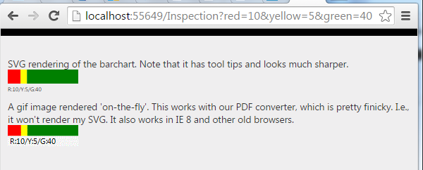
At work, I use this to display inspection data. The data displayed summarizes pass/fall/monitor counts for inspection details. Any given inspection may, for example, have 10 failed inspection details (red), 5 details needing monitoring (yellow) and 40 passed (green) detail items. Effectively, I am graphing the header for the inspection, showing the severity of its details. Also at work, I place the chart inside a table, which is one reason I don’t want a full-bore chart control.
The nice thing about this is I always know I will need between 0 and 3 colored rectangles.
Each chart is a set of 3 rectangles: one rectangle fore each color. With both technologies, drawing a rectangle is simple matter of calculating the height and width, specifying a color and a position to draw it at. I think you know enough for me to jump into some code:
Here’s the Code from my MVC View File (.cshmlt)
@model ProgBar.Models.Inspection

@Html.Raw(Model.ColorGraph)

<img src="@Url.Action("GetHorizontalBarchartImg",
		new { red = Model.RedCount,
			  yellow = Model.YellowCount,
			  green = Model.GreenCount })" />
The code above is from my View file, which, if you don’t know MVC, is the last layer of code before the web server sends the html page to the user. Obviously, my model and controller are doing the work here, but I wanted to show you the simple part first! In case you aren’t familiar with MVC, the model statement at the top makes it possible to reference my model class (“Inspection”) in the markup, for example, ColorGraph is a property of my model, and ‘GetHorizontalZBarchartmg” is a method on that same class.
Here’s How it Looks When Rendered into HTML
<!-- The SVG rendered into HTML -->
<svg Height='40' Width='100'>
    <rect x='0' y='0' width='18.1818181818182' height='20' fill='red'>
      <title>10</title>
    </rect>
  <rect x='18.1818' y='0' width='9.09090909090909' height='20' fill='yellow'>
    <title>5</title>
  </rect>
  <rect x='27.2727' y='0' width='72.7272' height='20' fill='green'>
    <title>40</title>
  </rect>
  <text x='0' y='31' fill='black' font-size='8'>R:10/Y:5/G:40</text>
</svg>

<!-- The second technique, an image rendered into HTML -->
<img src="/Inspection/GetHorizontalBarchartImg?red=10&yellow=5&green=40" />
As you can see, the SVG item has all the details, which gives the benefit of allowing you to manipulate it with javascript (for example, you could make something happen when user clicks a colored rectangle). In contrast, the image is a just like any other, except for the fact that I render it on demand. It is completely static by the time it arrives at the users’ browser.
Now the Code to Build my SVG
  public class Inspection {
    private int DEFAULT_HEIGHT = 30;
    private int DEFAULT_WIDTH = 100;

    private string _ColorGraph = "";
    public string ColorGraph {
      get {
        if (string.IsNullOrWhiteSpace(_ColorGraph))
          _ColorGraph = BuildColorGraph();
        return _ColorGraph;
      }
    }

    private string BuildColorGraph() {
      string boxPattern = "<rect x='{0}'  y='{1}' width='{2}' height='{3}' fill='{4}'><title>{5}</title></rect>";
      string redRect = "", greenRect = "", yellowRect = "";
      int tot = RedCount + GreenCount + YellowCount;
      double barHeight = 20;//0.667 * Height;

      if (RedCount > 0) {
        redRect = string.Format(boxPattern, 0, 0, Width * ((double)RedCount / tot), barHeight, "red", RedCount);
      }

      double xPos = Width * ((double)RedCount / tot);
      if (YellowCount > 0) {
        yellowRect = string.Format(boxPattern, xPos, 0, Width * ((double)YellowCount / tot), barHeight, "yellow", YellowCount);
      }

      xPos += Width * ((double)YellowCount / tot);
      if (GreenCount > 0) {
        greenRect = string.Format(boxPattern, xPos, 0, Width * ((double)GreenCount / tot), barHeight, "green", GreenCount);
      }

      string textPattern = "<text x='{0}' y='{1}' fill='black' font-size='8'>R:{2}/Y:{3}/G:{4}</text>";
      string theText = string.Format(textPattern, 0, 31, RedCount, YellowCount, GreenCount);
      string result = "<svg Height='" + Height.ToString() + "' Width='" + Width.ToString() + "'>"
            + redRect
            + yellowRect
            + greenRect
            + theText
            + "</svg>";
      return result;
    }

    public string InspectionNumber { get; set; }
    public int RedCount { get; set; }
    public int GreenCount { get; set; }
    public int YellowCount { get; set; }

    private int _Height;
    public int Height {
      get {
        if (_Height == default(int))
          _Height = DEFAULT_HEIGHT;
        return _Height;
      }
      set { _Height = value; }
    }
    private int _Width;
    public int Width {
      get {
        if (_Width == default(int))
          _Width = DEFAULT_WIDTH;
        return _Width;
      }
      set { _Width = value; }
    }
}
As you can see, I just build a string that looks like the rendered HTML. I build each rectangle separately, as a string, then concatenate three all together. The only “hard” part is calculating the rectangle widths, which you should be able to do if you can perform elementary algebra.
Hair-Splitting?
Some purists would say the model should not be responsible for creating any kind of formatting, and they’d have a point. My Inspection class should not return html; it should be agnostic about the display technique used. And they’d be right. However, it is pretty easy to move the code into the controller; I have not done so because I was not able to make this fine code work with our PDF generator.
If you want to move that code into the controller, it would be with a technique similar to how I build my chart image, in the next section.
Here’s the Code to Dynamically Render an Image
public class InspectionController : Controller
{
    public ActionResult GetHorizontalBarchartImg(int red, int yellow, int green,
        int canvasHeight = 30, int canvaseWidth = 100) {

        Bitmap bmp = new Bitmap(canvaseWidth, canvasHeight);
        Graphics g = Graphics.FromImage(bmp);
        g.SmoothingMode = System.Drawing.Drawing2D.SmoothingMode.HighQuality;
        float colorSum = red + yellow + green;
        float redWidth = (float)(red / colorSum * 100);
        float yellowWidth = (float) (yellow / colorSum * 100);
        float greenWidth = (float) (green / colorSum * 100);
        if (red > 0) {
            if (redWidth < 1)
                redWidth = 1;
            g.FillRectangle(Brushes.Red, 0.0F, 0.0F, redWidth, 15);
        }

        if (yellow > 0) {
            if (yellowWidth < 1)
                yellowWidth = 1;
            g.FillRectangle(Brushes.Yellow, redWidth, 0, yellowWidth, 15);
        }

        if (green > 0) {
            if (greenWidth < 1)
                greenWidth = 1;
            g.FillRectangle(Brushes.Green, redWidth + yellowWidth, 0, greenWidth, 15);
        }

        g.FillRectangle(Brushes.WhiteSmoke, 0, 15, 100, 15);
        string caption = string.Format("R:{0}/Y:{1}/G:{2}", red, yellow, green);
        g.DrawString(caption, new Font("Segoe UI", 8F), Brushes.Black, 1, 16);

        using (MemoryStream ms = new MemoryStream()){
            bmp.Save(ms, System.Drawing.Imaging.ImageFormat.Gif);
            return File(ms.GetBuffer(), "image/gif");
        }
    }

    public ActionResult Index(int red, int yellow, int green) {
        Models.Inspection insp = new Models.Inspection { GreenCount = green,
                          RedCount = red,
                          YellowCount = yellow,
                          Height = 40,
                          Width = 100
                        };
        return View("index", insp);
    }
}
Note: you will need to add a reference to your project, to System.Drawing.
Also note: depending on your security model, you may need to decorate the ‘GetHorizontalBarchartImg’ method with an ‘[AllowAnonymous]’ tag.
The big picture:
- First I get a drawing context to an in-memory Bitmap object
Graphics g = Graphics.FromImage(bmp);
- Use the drawing method ‘fillRectangle’ to build 3 colored rectangles, for example,
g.FillRectangle(Brushes.Red, 0.0F, 0.0F, redWidth, 15);
- Add other features to the bitmap, such as text
g.DrawString(caption, new Font("Segoe UI", 8F), Brushes.Black, 1, 16); - Save your bitmap to a memory stream (any stream type will work, memory stream is best for use)
- Convert the memory stream to a file and return it to your caller, namely, your page controller.
        using (MemoryStream ms = new MemoryStream()){
            bmp.Save(ms, System.Drawing.Imaging.ImageFormat.Gif);
            return File(ms.GetBuffer(), "image/gif");
        }
Summary
There are lots of ways to build charts, and users typically love them. SVG is great for small charts, but for my purposes, wasn’t easy to convert to PDF (there are other ways and I sure it would work fine in your environment). You can also build an image in memory, and return it to your controller as a dynamically-built file object.
Both techniques involve drawing rectangles with arithmetic and simple algebra. You can provide any color you like and the text is optional.
Download the Code!
You can get the code and play with it, or adapt it to your needs. Link to download
WPF – Animate Textboxes to Highlight Bad Data
WPF makes extremely good UIs (i.e. easy to use and attactive), but most programmers don’t take advantage of the power at their fingertips. One common scenario is providing immediate feedback when your users mess-up. I like to know immediately, not when I try to click the button to submit. Because I hate it when I don’t realize I made a mistake until long after the fact!

The Technique
- Set-up validation for multiple textboxes with the same code
- Using delegates to reduce your code!
- Build a border animation
- Using a gradient
- Your gradient will use a moving middle stop, generating something like a wiping effect
- Every time the textbox change event fires, call your validation on users’ text;
- If bad, display your fancy animation, and set the tool tip and status bar message
The result looks (IMHO) pretty slick and is hard. I prefer it to the standard technique (IDataErrorInfo) for scenarios when I have several textboxes with the same validation rules, because it is less work overall.
The Fun Part – Animate Your Border!
public static void ReddenTextboxBorder(TextBox txt, MainWindow theMainWindow) {
    //Starting by defining 3 gradient stops; the middle one will move from left to right
    GradientStop stop1 = new GradientStop(Colors.Black, 0);
    GradientStop stop2 = new GradientStop(Colors.Red, 0);

    //Since we created the stop 'on-the-fly', we need to register the name to animate
    theMainWindow.RegisterName("stop2", stop2);
    GradientStop stop3 = new GradientStop(Colors.Black, 1);

    //We will use the brush for the border being animated, tell it all 3 stops:
    LinearGradientBrush gradBrush = new LinearGradientBrush(new GradientStopCollection { stop1, stop2, stop3 });
    txt.BorderBrush = gradBrush;

    //The animation will go from 1% to 99% over .3 second time period:
    DoubleAnimation ani = new DoubleAnimation(.1, .99, new Duration(TimeSpan.FromMilliseconds(300)));
    //When we hit the right border, bounce back to the left again:
    ani.AutoReverse = true;

    //Storyboard helps connect the animation parts
    Storyboard sb = new Storyboard();
    Storyboard.SetTargetName(ani, "stop2");
    Storyboard.SetTargetProperty(ani, new PropertyPath(GradientStop.OffsetProperty));
    sb.Children.Add(ani);

    //After the animation is don, set the border to pure red (no gradient)
    sb.Completed += delegate(object sndr, EventArgs evtArg) { txt.BorderBrush = new SolidColorBrush(Colors.Red); };

    sb.Begin(theMainWindow);
    //By unregistering the name, I release memory and become confident I can re-run without issues
    theMainWindow.UnregisterName("stop2");
}
At this point, we have a method to animate any textbox, so long as it inhabits our main form. It looks cool and tells the user they messed-up with minimal pain. Now, let’s hook-up several textboxes to use our new method:
Connect the Animation to Your Validation
private void SetUpRequiredFieldValidation()
{
    //An array of textboxes which must be populated before user
    //can click the button to do some work
    TextBox[] _RequiredTextBoxes = new[] { txtName,
                         txtAddress,
                         txtCity,
                         txtState,
                         txtZip
                         };

    //Hook-up a TextChanged event for every textbox in the array;
    foreach (TextBox tb in _RequiredTextBoxes)
    {
        //Dynamically declare an event to fire for each textbox using a delegate
        tb.TextChanged += delegate(object sender, TextChangedEventArgs e) {
            //'ValidIdentifier' (omitted for clarity) is my Regular Expression that checks
            //whether the textbox text is valid. You could substitue
            /your own validation logic here, such as 'String.IsNullOrWhitespace(tb.Text)'
            if (Utility.ValidIdentifier.IsMatch(tb.Text))
            {
                //Omitted for clarity - clear the color/tooltip/border thickness etc.
                ResetTextboxBorder(tb);
            }
            else
            {
                tb.BorderThickness = new Thickness(3);
                ReddenTextboxBorder(tb, this);
                tb.ToolTip = "Invalid name";
                //Display some information in the status bar:
                stbMessage.Text = "Learn to type, user!";
            }
        };
    }
}
Here, I build an array containing all the textboxes I wish to validate. I then loop through them, and for each textbox, hook-up a TextChanged event. That event
- Checks if the uers’ text is valid, if so
- Clear any previous effects from the textbox
- Otherwise, animate the border and set the tool tip
Summary
Animation makes your applications easier to use and less frustrating. More importantly, apps with animated feedback require less training. If you have a lot of users, training costs can be significant, so you are really cutting-down on the cost to run your app. Your user manager should love you when you save them costs! Maybe you will be recognized for writing superior code! BTW, you could do this in HTML/ASP or other web technologies, but not as slickly nor as easily! WPF makes vastly superior UIs!
Use DataTriggers to Initiate WPF Animation From Code
WPF has some great animation abilities; you might think they are toys, but in reality they are important, under-utilized tools for making your app easier to use. Use animation to draw attention to things that change or which users should pay attention to. Some studies have suggested that this kind of UI improvement can reduce training costs and improve your users’ efficiency by 10-40%.
You can initiate animation several ways, including when some routed event occurs. However, some not everyone knows how to start animation from code. A great way to do it is to use DataTriggers.
My little sample uses a timer (in code) to initiate flashing, but you could use any other code you like, so long as it sets the property “StartFlashing” to true. But we’ll get to that shortly. First, let’s start be defining a style that uses animation.
<Window.Resources>
  <Style x:Key="timerTriggeredFlash" TargetType="Label">
    <Style.Triggers>
      <DataTrigger Binding="{Binding RelativeSource={RelativeSource AncestorType=Window},
         Path=DataContext.StartFlashing}" Value="True">
          <DataTrigger.EnterActions>
             <BeginStoryboard>
               <Storyboard>
                  <ColorAnimation
                     Storyboard.TargetProperty="(Background).(SolidColorBrush.Color)"
                     From="White" To="Red" RepeatBehavior="3x"
                     AutoReverse="True" />
                   </Storyboard>
             </BeginStoryboard>
          </DataTrigger.EnterActions>
      </DataTrigger>
    </Style.Triggers>
  </Style>
</Window.Resources>
Note that
- You will reference the style below using its name, “timerTriggerdFlash”
- Your trigger references a property in your code named “StartFlashing”, it should be boolean
- When you set that property to true, the animation starts
- The target property is a bit tricky; basically the syntax references an attached property of the background’s brush
The next thing to do is reference the style in your label, as shown here:
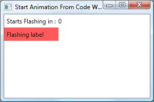
<Label Grid.Row="1" Style="{StaticResource timerTriggeredFlash}" Content="Flashing label" />
Pretty simple, but it doesn’t hurt to spell things out!
Now, for the property that initiates the flashing (StartFlashing). We will bind our form to a ViewModel (class) and expose that property publicly, making sure to implement INotifyPropertyChanged. (Alternatively, you could make your property a DependcencyProperty, which I prefer, but which requires additional explanation.)
I think it is easiest if I show the entire ViewModel class:
public class MainWindowViewModel : INotifyPropertyChanged {
	DispatcherTimer _Timer;

	//Constructor
	public MainWindowViewModel() {
		_Timer = new DispatcherTimer();
		_Timer.Interval = TimeSpan.FromSeconds(1);
		_Timer.Tick += new EventHandler(_Timer_Tick);
		_SecondsLeft = 3;
		_Timer.Start();
	}

	//This event is fired every second, when the timer goes off
	void _Timer_Tick(object sender, EventArgs e) {
		SecondsLeft = SecondsLeft - 1;
		if (_SecondsLeft <= 0) {
			StartFlashing = true;
			_Timer.Stop();
		}
	}

	//This property controls our DataTrigger!
	private bool _StartFlashing;
	public bool StartFlashing {
		get { return _StartFlashing; }
		set {
			_StartFlashing = value;
			if (PropertyChanged != null) {
				PropertyChanged(this, new PropertyChangedEventArgs("StartFlashing"));
			}
		}
	}

	//This property is displayed as the countdown seconds:
	private int _SecondsLeft;
	public int SecondsLeft {
		get { return _SecondsLeft; }
		set {
			_SecondsLeft = value;
			if (PropertyChanged != null) {
				PropertyChanged(this, new PropertyChangedEventArgs("SecondsLeft"));
			}
		}
	}

	public event PropertyChangedEventHandler PropertyChanged;
}
Note that
- In the constructor, we create a timer that fires every second and initialize our countdown to 3 seconds
- When the timer goes-off, it decrements the countdown
- When the countdown hits zero, it stops the timer and sets our property “StartFlashing” to True
- Which triggers the animation
In case you haven’t done this before, you need to tell your form where to get its binding from, by assigning a DataContext. Our DataContext will be our ViewModel, and we assign it in our form’s constructor, like this:
public partial class MainWindow : Window {
	public MainWindow() {
		InitializeComponent();
		this.DataContext = new MainWindowViewModel();
	}
}
The last thing is to display the form’s XAML.
<Window x:Class="AnimatedAlarm.MainWindow"
        xmlns="http://schemas.microsoft.com/winfx/2006/xaml/presentation"
        xmlns:x="http://schemas.microsoft.com/winfx/2006/xaml"
        Title="Start Animation From Code With Data Binding" Height="200" Width="300"
        WindowStartupLocation="CenterScreen" >

    <Window.Resources>
        <Style x:Key="timerTriggeredFlash" TargetType="Label">
            <Style.Triggers>
                <DataTrigger Binding="{Binding RelativeSource={RelativeSource AncestorType=Window},
                            Path=DataContext.StartFlashing}" Value="True">
                    <DataTrigger.EnterActions>
                        <BeginStoryboard>
                            <Storyboard>
                                <ColorAnimation
                                    Storyboard.TargetProperty="(Background).(SolidColorBrush.Color)"
                                    From="White" To="Red" RepeatBehavior="3x"
                                    AutoReverse="True" />
                            </Storyboard>
                        </BeginStoryboard>
                    </DataTrigger.EnterActions>
                </DataTrigger>
            </Style.Triggers>
        </Style>
    </Window.Resources>

    <Grid>
        <Label Content="Starts Flashing in :" />
        <TextBlock Grid.Column="1" Text="{Binding SecondsLeft}"
                   VerticalAlignment="Center" />

    <Label Grid.Row="1"
           Style="{StaticResource timerTriggeredFlash}"
           Content="Flashing label" />

        <Grid.RowDefinitions>
            <RowDefinition Height="auto" />
            <RowDefinition Height="auto" />
            <RowDefinition />
        </Grid.RowDefinitions>
        <Grid.ColumnDefinitions>
            <ColumnDefinition Width="auto" />
            <ColumnDefinition />
        </Grid.ColumnDefinitions>
   </Grid>
</Window>
In summary, use a DataTrigger when you need to initiate animation from code. Declare a style for your control and, in the data trigger, bind to a property from your form’s DataContext, typically a ViewModel. In your code, make sure that your bound property (e.g. StartFlashing) raises the PropertyChanged event, or else is a DependencyProperty.
Make the WPF GridSplitter Work Correctly!
You can find lots of articles explaining how to use a WPF GridSplitter, but the ones I’ve seen never work quite right. Actually, they seem to work until you add some more realistic code, and then things start going haywire! In this post I explain a couple of gotcha’s, plus one nifty trick to give your splitter a 3-d appearance.


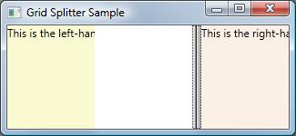
The First Gotcha – The Wrong Column Stretches!
If you are trying your first GridSplitter, chances are you will omit a tag that looks completely unnecessary: the HorizontalAlignment tag (or, if you are splitting rows, the VerticalAlignment tag). If you omit that tag, your screen will look like this when you drag the splitter:
The correct XAML looks like this:
<GridSplitter Grid.Column="1" ResizeDirection="Columns" Width="10" ToolTip="Drag left-right to resize"
HorizontalAlignment="Stretch" />
Why do you need that tag? I wish I knew, I’ve never seen it discussed.
Gotcha Number Two
The next problem you’ll need to fight is when the wrong columns (or rows) get resized, or when nothing is resized whatsoever! Generally this happens when
- You have 3 columns…
- Your middle column holds the splitter…
- And you auto-size either column zero, column 2, or both!
Important principle:If you specify the size of any row or column, even autosizing it, the GridSplitter cannot change it’s size!
Further, if you have more than three columns, you should make sure that exactly two of them lack any width specification; they will be resized. If you have 4, 5, or more columns, please specify a width, typically ‘width=Auto”‘.
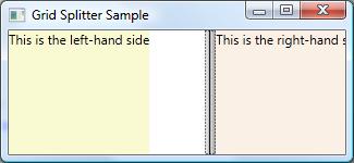
Tip: Give Your GridSplitter a 3-d Appearance
Even with a tool tip, your users might not realize that they should drag your GridSplitter around. (But they might get frustrated try knocking it around!) But, make it look 3-d and they will cotton-on pretty quick. The best way to do that is to
- Use an ImageBrush for your background
- If you’re using an older version of WPF, specify TileMode=”Tile” for the brush
- I like to save a bit on resources and use the smallest possible image for my background (such as 8×1 pixels), letting the tile mode spread it across the available area.
Here is the XAML:
<GridSplitter Grid.Column="1" ResizeDirection="Columns" Width="10" ToolTip="Drag left-right to resize"
               HorizontalAlignment="Center">
     <GridSplitter.Background>
         <ImageBrush ImageSource="/SplitterSample;component/Images/Splitter8x1.jpg" />
     </GridSplitter.Background>
</GridSplitter>
Here is what my background image looks like (magnified 8x):

WPF will stretch (tile) your image to fill the available space, causing your image to magically appear like a 3-d bar!
Code Listing
Finally, here is the full XAML. If you wish to try it, make sure you create a sub-folder in your project named ‘Images’ and place your background image in that folder. Also, replace ‘SplitterSample’ with your project name where the ImageBrush is referenced.
<Window x:Class="SplitterSample.MainWindow"
 xmlns="http://schemas.microsoft.com/winfx/2006/xaml/presentation"
 xmlns:x="http://schemas.microsoft.com/winfx/2006/xaml"
 WindowStartupLocation="CenterScreen"
 Title="Grid Splitter Sample" Height="150" Width="325">
 <Grid>
     <Grid.ColumnDefinitions>
         <ColumnDefinition />
         <ColumnDefinition Width="auto" />
         <ColumnDefinition />
     </Grid.ColumnDefinitions>

     <TextBlock Background="LightGoldenrodYellow" Text="This is the left-hand side" />
     <GridSplitter Grid.Column="1" ResizeDirection="Columns" Width="10" ToolTip="Drag left-right to resize"
                 HorizontalAlignment="Center" >
          <GridSplitter.Background>
              <ImageBrush ImageSource="/SplitterSample;component/Images/Splitter8x1.jpg" />
          </GridSplitter.Background>
     </GridSplitter>

     <TextBlock Grid.Column="2" Background="Linen" Text="This is the right-hand side" />
 </Grid>
</Window>
 Randy's Rants, Ravings and Reflections